
Home > Printing News and Printing Knowledge > 10 Tips To Improve Your Design For Better Printing Quality
10 Tips To Improve Your Design For Better Printing Quality
Published Time:2016-08-01 Original Source:10 Tips To Improve Your Design For Better Printing Quality
10 Tips To Improve Your Design For Better Printing Quality
With the below 10 tips, we hope to help novice designers on their way to better print design. The tips are for print design in general: doesn't matter if it's a brochure or a poster or the identity In no particular order.
1.) Remember to bleed
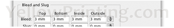
The bleed is the part on the side of the document that gives your printer that small amount of space to move around paper and design inconsistencies. No matter what guidelines they have on their site, the printer will use anything you throw at them. A 3mm bleed on all sides is a safe standard for the work.
The settings in InDesign are right there in the new file dialog… but hidden! You need to hit the 'more options' button before they become visible. If you already have a document open you can find them in the file > document setup dialog. Read more in the article What is bleed/bleeding.
Bleed settings in Adobe InDesign:
2.) Overprint is fun
Is your budget limiting you to only 2 Pantone(PMS) colors? No problem. Try to experiment with overprint options to get a look with more depth with a limited color palette.
You can even work with photographs with only 2 Pantone's, just do them in duotone or monotone.
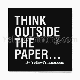
3.) Keep the necessary border on the paper
The human mind fills in gaps and will see the bigger picture if you aim for it. Using the border of your paper can be great fun and another tool to work with.
Thinking inside…
Think outside the box in print design
Thinking outside…
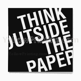
Obviously, this is not the final solution to all your design problems. It should help you to see that your work doesn't end at the edge of the paper.
4.) Paper size standards are great, but don't let them hold you back
Square booklets, for instance, make for a more interesting reading experience, while smaller sizes (A5 for example) are much easier to take with you. Fly away from that standard A4 and take some risks.
5.) Readability for People
In conflict with some designers of the last 5 years I still think form follows function. This means in print design: If you're working on something that contains textual content concentrate on the content.
You should use typography as a element in your design, however you should always aim for optimal readability.
6.) Amount of content: less is more
YellowPrinting.com
If you have some kind of idea that there's too much on your page; there is indeed to much on your page. Define what's really necessary and remove any visual noise. It may sound cliche but it's true: less is more. If the client makes you cram too much content on one page, tell them.
7.) Stick to the grid
Working with grids is the key to good design. Using its proportional relations, composition guidelines for the base of your design is a good idea.
Grid example in magazine
A simple but well excecuted 3-column grid in a magazine
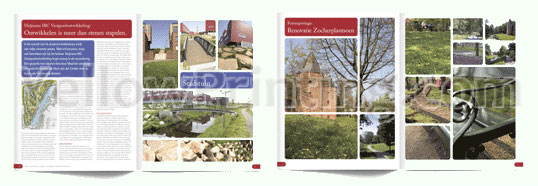
Don't always go for the standard 3-column setup. A 7 column setup offers a lot of playful combinations… 2 column overlaps, a 3/3/1 setup with a sidebar and so on…
8.) Typography is king
If the typographical setup is bad, no amount of lines or other elements will fix it. The fonts you use the most in your project set the voice for its overall feel: don't pick the first font you like; think about what voice it should have and the best way to communicate this to your target audience. You can have a lot of fun with the basic well designed fonts: Helvetica, Swiss or Akzidenz Grotesk will save you from the worst typographic horror-scenario's.
It takes a while to get to know a font. A good way to get good with a particular font is to pick a list of 5 to 8 fonts you think could work for you and concentrate on those. That's also a good way to find out which fonts mix and which won't.
9.) Invert
Need to give a bigger impact to a quote or logo? Invert it. White on black (or on any dark color for that matter) will always give your design or typography more strength.
Less impact
Normal

More impact
Inverted

Be careful with smaller type sizes (8pt. and lower) as these will be possible problems for your printer as ink always flows around a little when just printed. This effect is called trapping. Of course this all depends on what kind of paper you're printing on, printing speed and other factors. Ask your printer about exceptions. YellowPrinting.com
10.) Be demanding about photographic content
You should always demand high quality source material to work with. When working with photographic content for example the "trash in, trash out" rule applies. A good photo can take your work to another level, a badly lit low resolution photo will ruin the work. Most clients will send you what they have for grabs… most of the time they don't understand quality or image resolutions. Bug them a bit and they'll magically come up with better material. In need of printing services? Consider printing your orders with YellowPrinting, thanks.