
Home > Printing News and Printing Knowledge > Useful printing guiding: 15 Printing Mistakes You Need to Avoid on Printing Artworks
Useful printing guiding: 15 Printing Mistakes You Need to Avoid on Printing Artworks
Published Time:2021-05-29 Original Source:Useful printing guiding: 15 Printing Mistakes You Need to Avoid on Printing Artworks
Useful printing guiding: 15 Printing Mistakes You Need to Avoid on Printing Artworks
During our past printing experience, we conclued the below illustrated list of the top 15 printing mistakes and errors you should avoid on printing artworks.
This article is aimed mainly at inexperienced printing designers, but it's also very useful guiding for you to prepare the printing artworks. We all make mistakes, so here’s a resource that should aid everyone who wants to expand their knowledge. Here goes…
1. Inadequate Bleeding on Artwork
printing mistakes - Inadequate bleed and adequate 3mm bleeding
If you don’t put in place a decent bleed in your artwork, you’re asking for trouble. Basically, “bleed” refers to artwork that extends beyond the document boundaries. This is necessary because the guillotines that will slice-and-dice your prints aren’t that accurate. Some behave better than others, but a safe bet is to have 3mm of bleeding (or 1/8 of an inch) for most print jobs that are ‘hand-held’, such as posters, letterheads and business cards, etc. Large format prints may require more bleed, so always ask your printer first.
♥
2. Using Small Text on a Rich Black Background
printing mistakes 2: Using white text on a rich black background
If you need small text knocked-out of a black background, make sure that it doesn’t include large amounts of cyan, magenta and yellow. If you do, the text will print blurred. This will happen because of ink-bleed and possible slight misalignment of printing plates. Even if digital print is used, this is still a problem and a cause of many printing mistakes.
For best results, use white text on a background that only has black in it, with no other colour. For a richer black background, use small amounts of coloured ink for a more suitable results. This principle doesn’t just apply to white-on-black, it also holds true for any colours─and text on textures, too.
♥
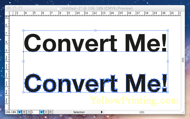
3. Images that are not converted to CMYK
printing mistakes 3:RGB to CMYK conversion box
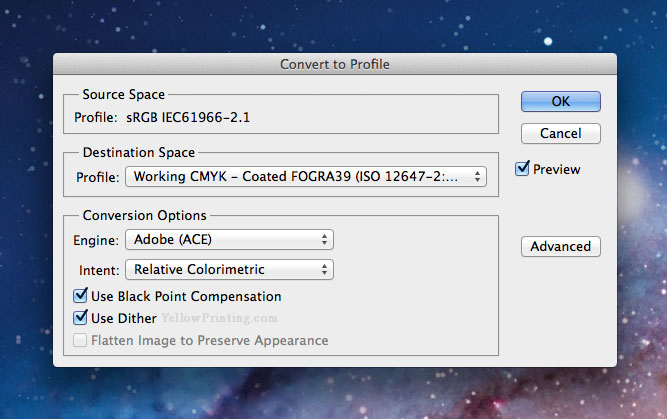
If you don’t know the difference between RGB and CMYK, you shouldn’t be sending anything to print at all—learn the basics before making an expensive error. You should make sure that you don’t forget to convert images to CMYK. Yes, modern PDF standards do convert RGB to CMYK automatically upon saving (or should), but the conversion may throw your colour all over the place. To be sure, convert profiles after either working in RGB or if you’re using digital photos.
♥
4. Spelling Mistakes (the mother of all printing mistakes)
spelling mistakes in printing
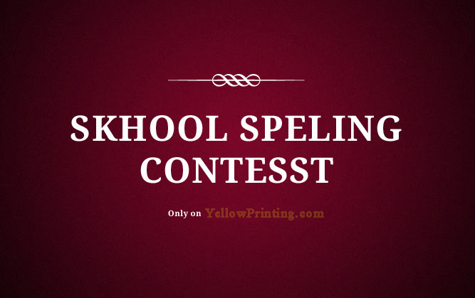
We all (well, most of us) make spelling mistakes from time-to-time online. I’ve made some real howlers throughout my years of blogging! However, spelling mistakes that aren’t noticed until a design has been printed is an obvious no-no.
I once sent off a limited amount of prints with a typo mistake (long story), but fortunately, it didn’t cost that much to reprint. For many print jobs, though, this is unacceptable due to costs and inconvenience. Proofs should always to be approved by the client. The designer should also check the spelling, even if they didn’t write the original copy text.
✔ Tip: Don’t totally rely on spell-checkers, as they won’t pick up on ‘then’ instead of ‘the’, for example.
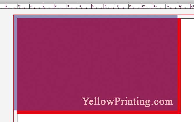
5. Designing Without Quiet Borders
quiet border example of printing mistakes
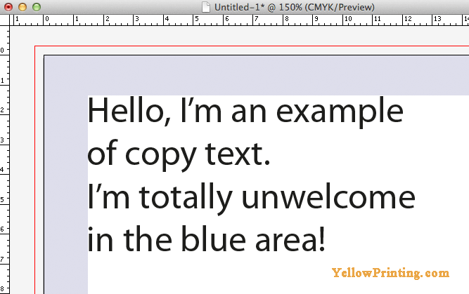
A quiet border is a sort of “buffer” area, where no text or defined elements (such as logos) should be located. In general, a quiet border should be at least 5mm (nearly 1/4 inch) from the edge of the document. In the example above, the edge of the document is shown in black. The red line is the bleed boundary (which is featured near the start of this post). This imaginary border is necessary because the guillotines can also trim up to 3mm off your artwork. This would mean that text could be chopped off if a quiet border isn’t observed. In the very worst scenario, having a 5mm quiet area should mean that there would still be a 2mm gap between the edge of your printed document and copy text.
✔ Tip: Here are some example quiet border minimum-widths which may be appropriate (depending on printer): Business Cards: 5mm, CD Sleeves: 8mm, Leaflets: 12mm, Posters: 25mm+. Of course, the design will effect how close texts are to the edge of the document. Note that the quiet border also has much to do with design more than avoiding printing mistakes.
The larger the print, the wider the quiet border should be.
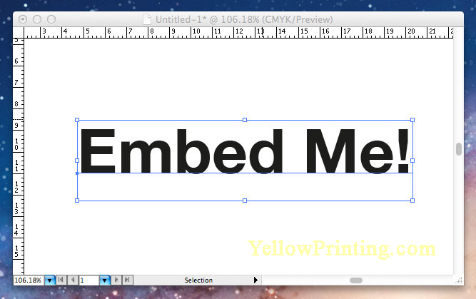
6. Fonts that are Not Converted to Outlines in Adobe® Illustrator or InDesign
convert fonts to outlines image
If you’re designing a CD sleeve, for example, you’d most likely use Adobe Illustrator to compile vector artwork and raster images. It’s a good idea to convert all the text used in the design to outlines before exporting as a PDF. Of course, fonts can be embedded using a modern PDF file standard, but in my opinion, doing this just removes any future potential problems from the finalizing process. After all, there can be problems with embedded fonts too in some cases, so converting your type just makes sense.
*UPDATE: Be sure though that if you are using very small type, such as 8pt or lower, that the outline conversion looks good. Sometimes, it doesn’t work out well, so always do a visual check.
✔ Tip: Make sure you make a backup file copy (or backup layer in the same copy) in Illustrator (or other program of your choice) before converting type to outlines. If the client wants design changes, you have the unconverted copy at hand.
♥
7. Image Resolution Too Low
image resolution too low
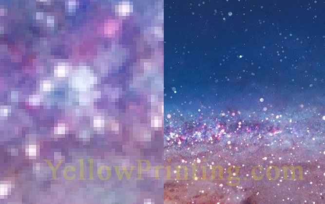
Image resolutions for print need to be between 300 pixels per inch (ppi) and 400 ppi. It really depends on the print service that is to be used. Setting the ppi too high can cause problems, but the major error some people make is setting the resolution too low. The common mix-up is using a 72 dpi (dots per inch) image instead of one that is 300 ppi or higher. Another common mistake is using a 72 dpi image that originated on the internet, and using it for print by enlarging it. No. No. No.
The only exception to this is if an image that was initially intended for the web was four-times the size as what is required for print. This could then be reduced to one-quarter file size dimensions. However, this wouldn’t solve the colour problem, which is outlined next. Images for web will use an sRGB colour space. When converted to a CMYK colour space, a lot of data will be lost and the colour conversion may not go well─it depends on the image used. If you have the copyright permission to use an image in this way, though, just be careful that its converted professionally.
♥
8. Using Raster Text and Logos Instead of Vectors YellowPrinting.com
Vector and raster texts
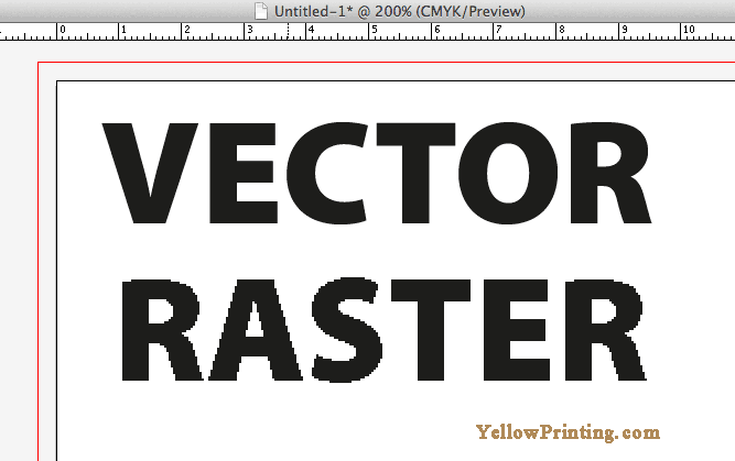
For pretty much any “hand-held” print work such as CDs and booklets, using vector typography is a must (this is a root cause of many printing mistakes). If you don’t, the text won’t look sharp. If you take a look at my example above, a vector graphic will look sharp because it’s made from mathematical formulae. Rasters are made from pixels, which are what digital images are made of.
There is a kind of cross-over point, though. If you’re designing large posters, for example, using text in Photoshop may work well if the type is over 16pt. This may actually be better if the typography has all kinds of treatments and effects applied. Always print proofs first before sending files to print, though.
♥
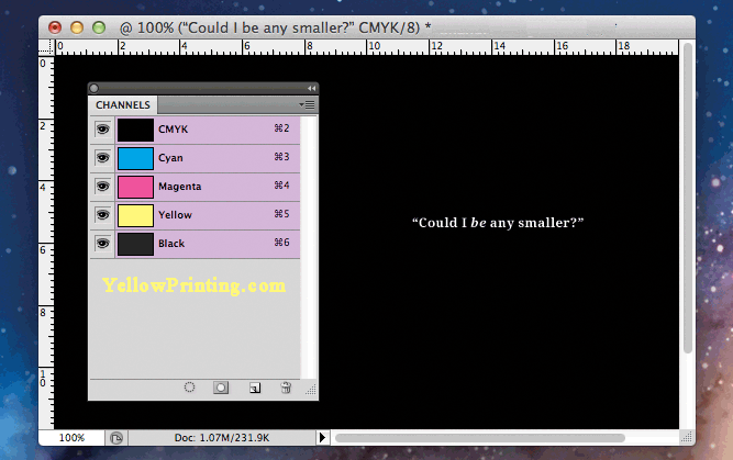
9. Saving Black & White Images in Colour
Greystyle converion from RGB
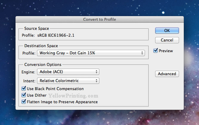
If you want your Black & White images to stay that way, make sure they’re setup or converted to a Grey-working space or profile. Otherwise, cyan, magenta and yellow inks will be added when your image is printed as part of a document. This is because colour will originally show in the cyan, magenta and yellow channels in your document if you use a CMYK profile.
Of course, you may want some colour in your black & white images to create a richer appearance, but these will need some Photoshop modification first.
♥
10. Using .gif or .png File Formats for Print – One of the Major Printing Mistakes
Don't use the gif file format for printing
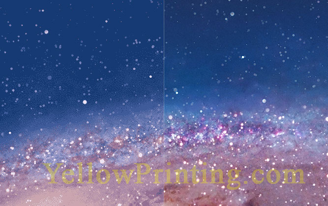
.gif and .png files are on-screen-only file formats. They are not intended for print and will not print well, so no wonder this is one of the major printing mistakes that can be made. This is because they have been developed to handle 72 ppi, whereas images for print need to be in the 300-400 dpi range. If you look at the image above, the right hand side shows a standard image, but the left shows (or simulates) how a .gif image may print. For very small images in print, you may get away with it, but get into the practice of using .tiff images when designing for printed material. You may be able to get away with using .jpeg files for print (if they are saved at very high quality), but every job is different and requires varied image-standards depending on application.
♥
11. Not Flattening Layers Before Exporting to PDF
Flatten Images before saving to PDF
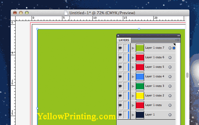
This is one of the main printing mistakes that has plagued me through my years as a designer. Here’s the situation, you have a deadline and need to export your awesome artwork from Illustrator as a PDF. This is all well and good, but you need to flatten layers first or your file will be huge. Your artwork “should” still print okay, but will bloat your file size and may send your printers’ Macs into meltdown. So, If you want a 1mb file instead of a 10mb one, flatten the file!
✔ Tip: Make sure you make a backup file copy first.
12. Fonts that are Not Embedded in Your PDF
embed fonts in illustrator image
If you’re sending for example, a 16-page booklet to print, its probably best not to convert the font to paths due to the length of the booklet. In cases like this (you’re probably going to be using Adobe® InDesign or Quark if you’re “old-school”), leave the copy font in place but make sure it’s embedded in the PDF when you export. If you don’t do this, the printer may not have the same font that you have used.
✔ Tip: In my opinion, embed the font or don’t use it at all.
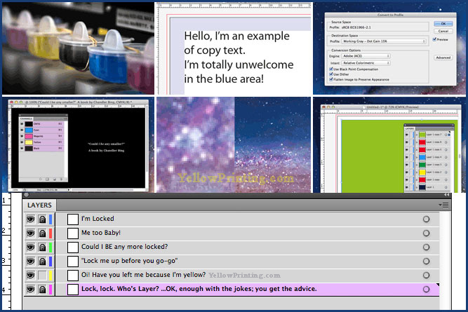
13. Not Locking Layers before Reviewing & Flattening a File
lock layers in illustrator or indesign
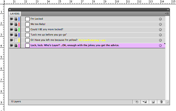
At first glance, this may seem like a strange tip and not a “printing mistake” as such, but it’s born out my my own experience. Here’s the deal: your design is perfect, you’ve printed it out and proof-checked it. Everything is fine, so you save another copy of the file and flatten it so you can export it.
What could go wrong? Well, when leaning over to get your coffee after reviewing that “all is fine”, you accidentally nudge your mouse which moves some text or image out of place because your layers aren’t locked. You get distracted by Twitter or something else, and you don’t try to close the file straight away. Then, when you do save it later on, the computer warns you the file needs saving, so you do. See where I’m going here? It’s happened to me a couple of times already. The situation is worse when you only nudge an element very slightly, and isn’t noticed until it’s too late! So, my advice is to always lock layers before saving or finalising.
✔ Tip: Get into the habit of always locking layers when element positioning in critical.
14. Not Supplying a Hard-Copy Proof
printing mistakes - make sure yoy supply a hard copy proof
I’ve been guilty of this many times, but only on smaller projects. My printer doesn’t require them for small print jobs, but they do encourage you to use their colour charts. However, for anything “major” or really expensive, I’d recommend sending in some printed proofs just to be sure.
✔ Tip: When printing proofs, try outputting them at 100% scale is possible, although of course, your paper size is the limit. When designing CD’s, create a mock-up and inset the prints into a spare jewel case, for example.
15. Really BAD Design Taste!
printing mistakes - printing price list image
Seriously, if a design is bad, don’t even bother printing it at all. The streets are awash with “designs” created by so-called designers that are simply hideous and should never have seen the light of day in the first place. Don’t even get me started on shop signs.